Eat No Wheat
LOGO & BRANDING
The Challenge
Create a full (fictional) food brand – including concept, target audience, name, and branding. I chose to create a brand that makes affordable packaged gluten-free snacks. Target audience: Frum families, with branding that would appeal to both kids and adults. The challenge was to create an identity that felt approachable and playful while still conveying quality and trust. Because the brand was intended for both kids and adults, the visual direction needed to strike a balance between youthful energy and a more mature, polished feel.
After much research, I settled on the name “Eat No Wheat” – a fun name that is easy to pronounce, memorable, and immediately communicates that the brand is gluten-free. I loved how straightforward the name sounds, while still having a playful, lighthearted quality that captures the character of the brand and could appeal to both kids and adults. The tagline is “good and gluten-free” – again, keeping the brand’s communication simple, friendly, and direct.
The brand will be starting out with two product lines: a line of packaged gluten-free crackers, and a line of individually wrapped gluten-free baked goods. The branding needed to work across both product lines, while also leaving room for the brand to grow into other areas, such as energy bars, pretzels, and maybe even Challah and breads.
Research and Discovery
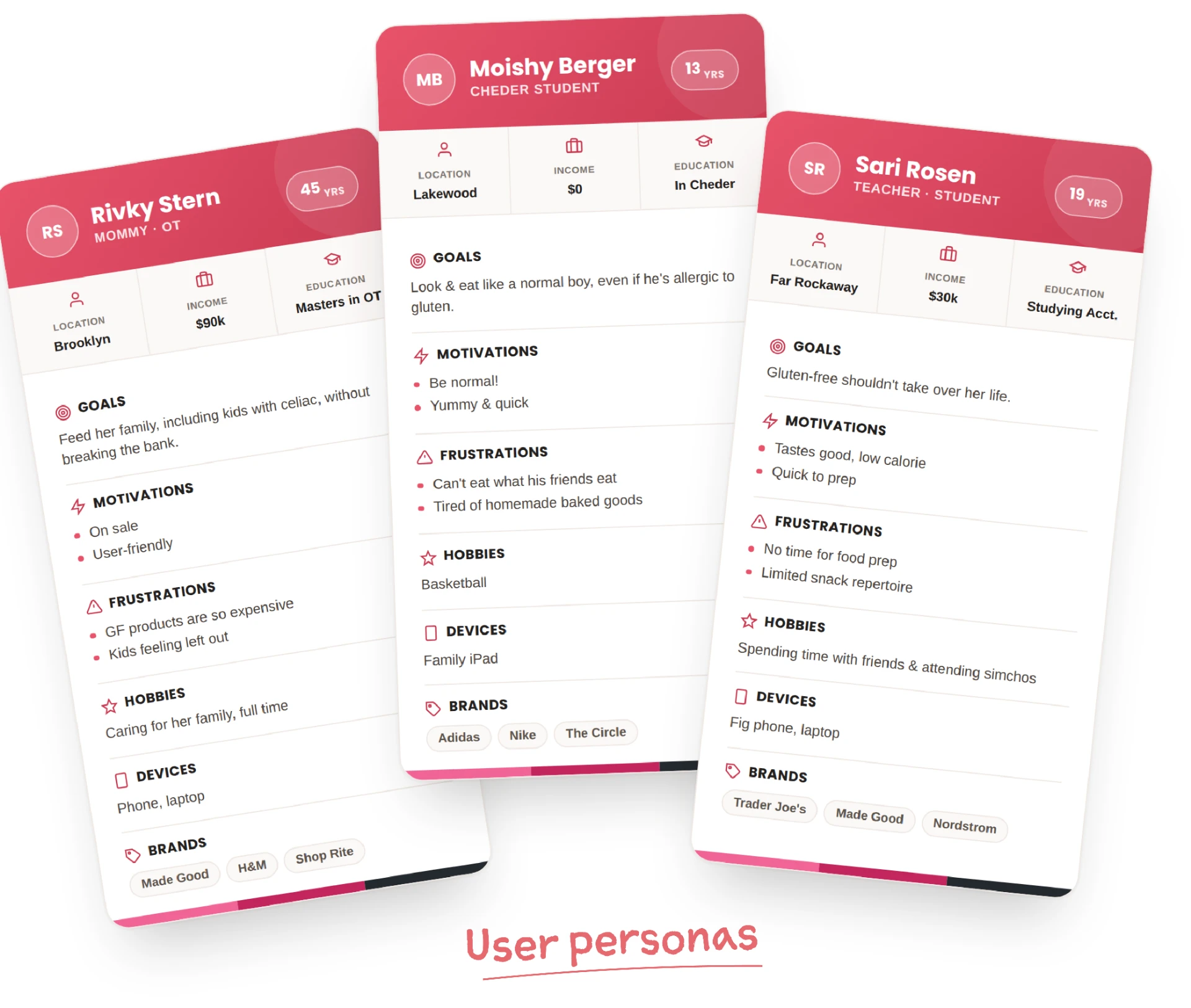
In order to better understand what the brand should be and how I wanted it to come across, I delved deeper into its audience, personality, and overall character using several brand discovery exercises. I started with a questionnaire to establish what the brand needed to communicate and what criteria were important. I then created three user personas – a mother, college student, and tween – to look at the brand from different perspectives and understand what each would be looking for. The three personas revealed a shared desire for gluten-free food that is affordable, convenient, and genuinely enjoyable, without feeling restrictive or different from “normal” food. While their priorities varied, they all wanted gluten-free eating to fit easily into everyday life.
Next, I used “would you rather” questions to get a better feel for the brand’s personality and narrow down the qualities I wanted it to convey. Finally, I created a list of how each of the five senses could apply to the brand and its products, helping me think beyond just the visual identity and consider the overall feeling I wanted the brand to evoke.
Armed with this knowledge, I made a mind-map to brainstorm different directions the brand could go in.
I then researched food brands in overlapping categories and noticed that most relied on wordmark logos. Many also leaned heavily toward either “cute” or “boring, old-style” design, without much balance between the two.
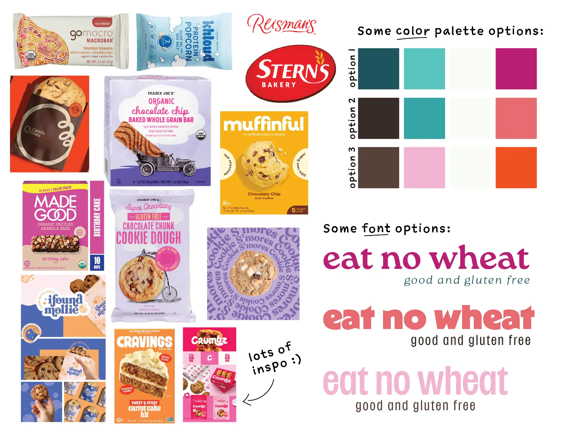
Based on my earlier brand exercises and this research, I explored different font and color options before bringing the research, ideas, and inspiration together into one mood board. The mood board established a brand direction that felt playful and energetic, while still feeling polished enough for adults.
The Logo
With the background information I needed, as well as the mood board for direction, I started with hand sketches, exploring how the letters could interact with each other and communicate the brand’s identity in a way that would keep the design distinctive but not overly complicated. I then moved onto the computer, using the fonts from my mood board to sketch out the ideas on Adobe Illustrator. I made many sketches, exploring a range of letterforms and arrangements. One direction stood out because it struck the balance I was looking for: playful enough to appeal to kids, but bold and clean enough to feel appropriate for adults. Once I settled on this logo sketch, I spent surprisingly long refining the spacing, angles, and relationships between the letters until the wordmark felt balanced.
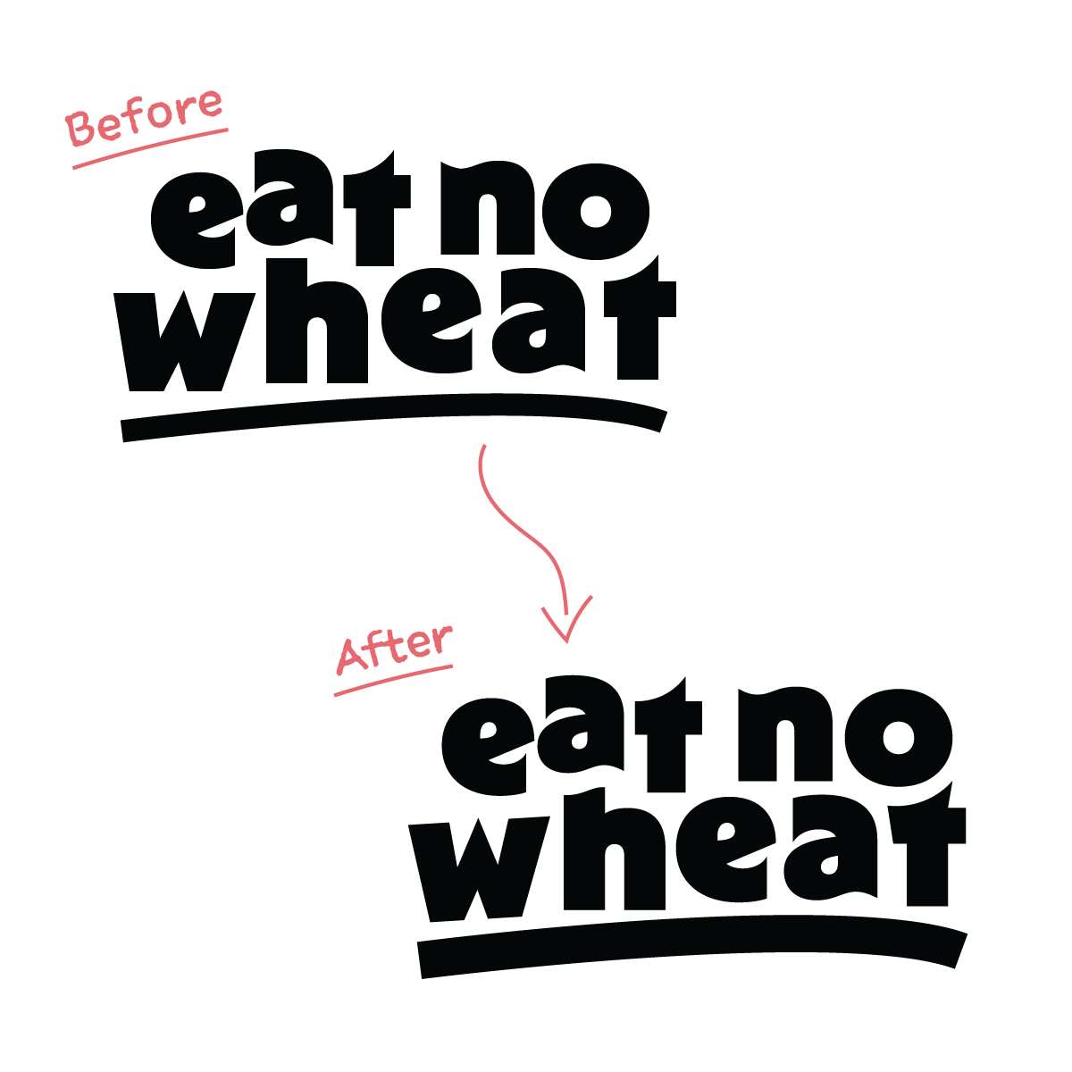
The final logo is a classic wordmark, with each letter fitting smoothly into the next to form a cohesive whole – much like the carefully proportioned ingredients that come together when baking. A central curve, generous spacing, and an underline add character and emphasis while keeping the wordmark balanced and easy to read.
Typography
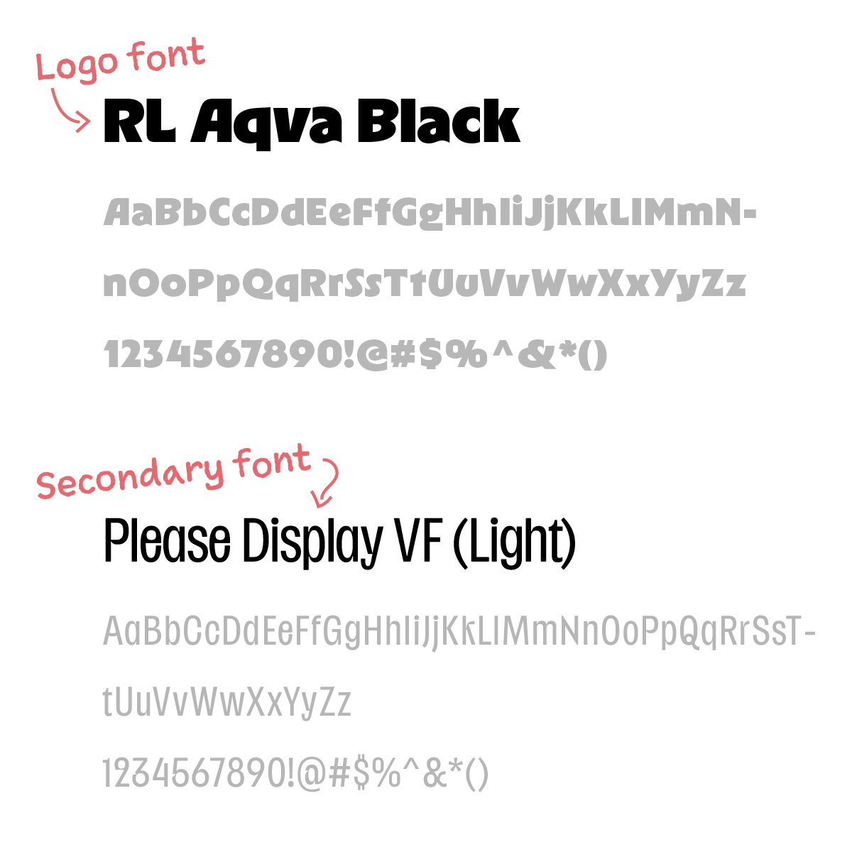
The logo font is set in RL Aqva Black, a bold font with character that gives the wordmark a strong, recognizable presence. Its mixture of rounded curves and sharp angles helps communicate the brand’s bold and playful personality, while its weight gives the logo a sense of reliability and confidence. The secondary font, used for the tagline in the secondary logo (the primary logo doesn’t contain the tagline) as well as other branding elements, is Please Display VF. Its thin weight creates contrast with the bold logo font, keeping the overall identity from feeling too heavy. The rounded letterforms bring a friendly quality, while the straight lines and connectors give it a more grounded feel. Together, the two fonts balance the brand’s playful personality with a sense of reliability and a clean, polished look.
Color
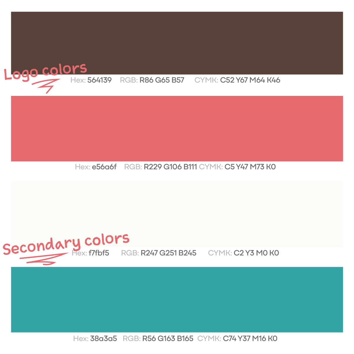
Eat No Wheat’s logo colors are deep mocha brown and light coral. I wanted the palette to feel warm and food-related, while still having enough color and energy to reflect the brand’s playful character. The brown adds warmth, comfort, and a sense of reliability, while the coral brings playfulness, sweetness, and happiness. The secondary colors, a mint-tinged white and tropical teal, add freshness and contrast. Together, the palette creates a balance of warmth and personality that can work across both product lines while leaving room for future products.
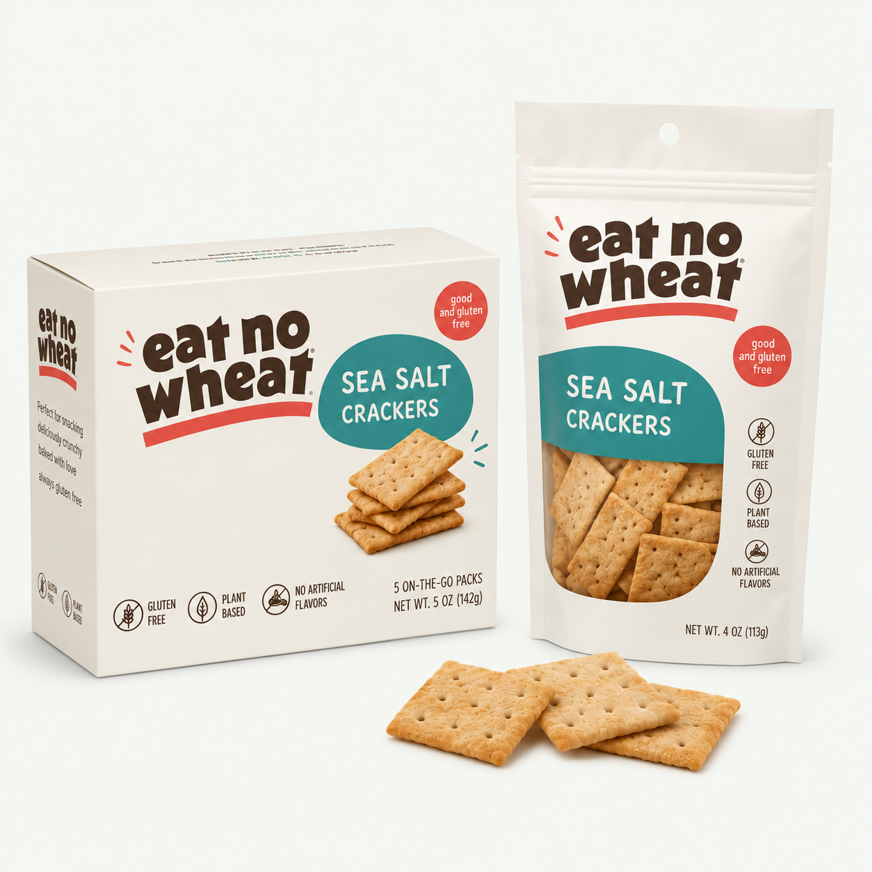
Packaging
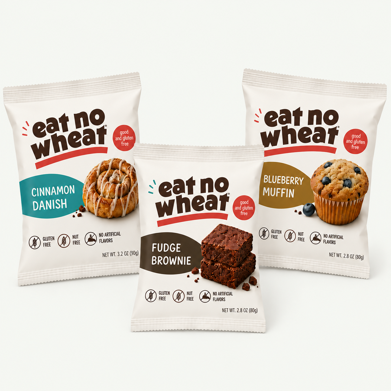
I applied the identity to both product lines – packaged crackers and individually wrapped baked goods – to see how the branding could work across different formats. The logo remains the main visual anchor, while color, product names, imagery, and flavor information create distinction between products. The system keeps the two lines cohesive while allowing each product to have its own personality, and provides a flexible foundation for future products as the brand expands.
Result
The final logo and branding brings together the qualities I wanted Eat No Wheat to communicate from the start: a gluten-free brand that feels straightforward, friendly, playful, and reliable. It creates a cohesive foundation for the brand while leaving room for it to grow beyond its initial products.